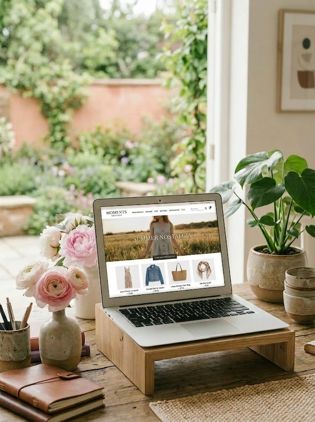
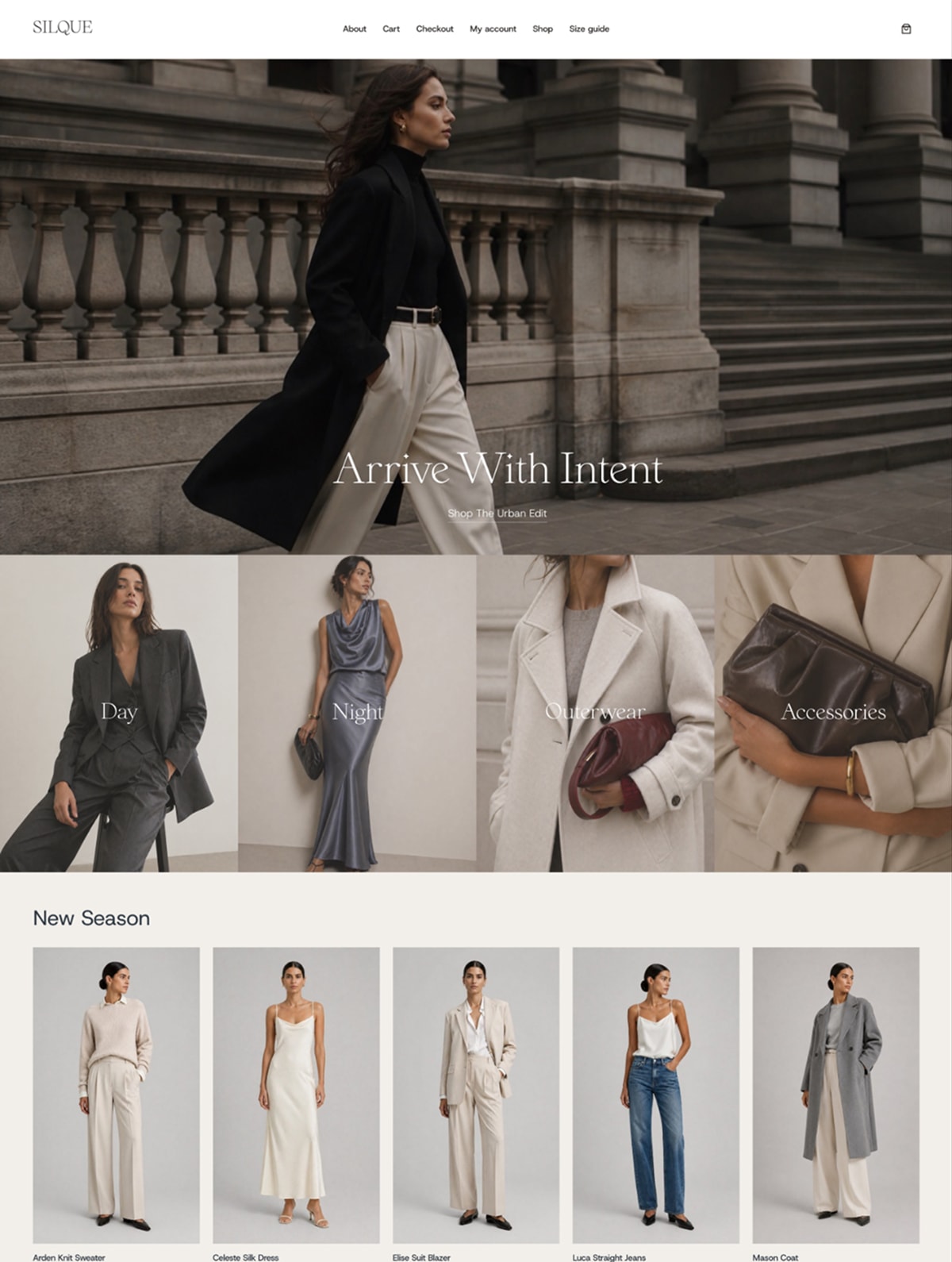
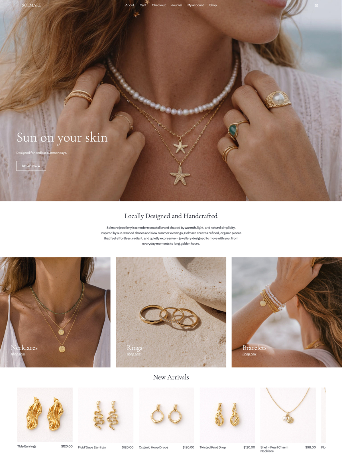
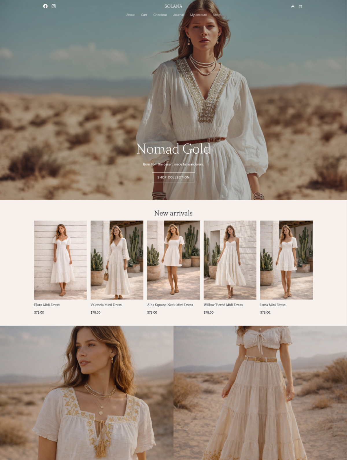
Your boutique homepage has roughly 5 seconds to tell a visitor what you sell, who it’s for, and why they should care. If those three things aren’t obvious above the fold, most visitors leave. The good news: a homepage that converts isn’t about clever design tricks. It’s about putting the right sections in the right order, and trusting your products and brand to do the rest.
This post walks through exactly what a boutique homepage needs to convert, section by section. Whether you’re selling clothing, candles, jewellery, or stationery, the structure below works because it answers the questions a visitor is actually asking when they land.
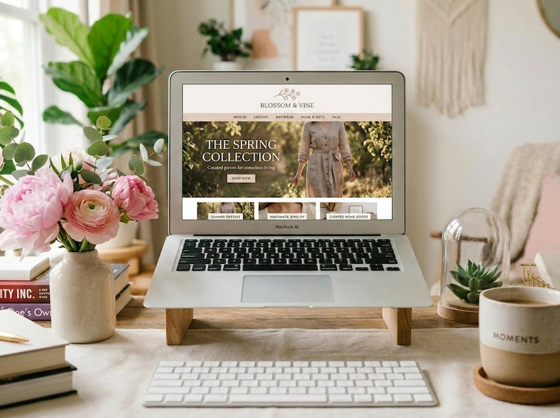
Why most boutique homepages quietly lose sales
Most boutique homepages fail not because they’re ugly, but because they’re vague. A pretty hero image with the words “Welcome to our shop” tells a visitor nothing. Neither does a homepage that opens with a 400-word brand origin story before showing a single product.
The pattern I see most often: gorgeous photography, a slow-loading slideshow, no clear path to actually shop, and a visitor who bounces in under 10 seconds. The homepage is doing aesthetic work, not sales work.
A boutique homepage that converts does five things, fast: it tells you what’s sold, shows the products, builds trust, makes the brand feel like a real brand, and gives the visitor an obvious next step. Everything below is built around those five jobs.
What the hero section actually needs to say
The hero is the only section every single visitor will see, so it has to do the heaviest lifting on your entire site. Three things belong here, nothing more.
- A clear statement of what you sell and who it’s for. “Hand-poured soy candles for slow mornings” beats “Welcome to Willow & Wax” every time.
- A single, well-lit photo that shows the product in context, not a stock image of a brick wall.
- One button. “Shop the collection” or “Shop new arrivals.” Not three buttons competing for attention.
If you sell across multiple categories, the hero is still not the place to list them all. Pick the strongest entry point (usually new arrivals or your bestselling collection) and let the next section handle category navigation.
Skip the rotating slideshow. They look impressive in theme demos and convert badly in real life. Visitors don’t wait through three slides to find what they came for, and most never see slides two and three at all.
How to make your product grid do the selling for you
The next section a visitor sees should be products, not a paragraph about your brand journey. People landed on your homepage because they’re considering buying something. Show them what they can buy.
A featured product grid of 6 to 8 items works well. Either pull in new arrivals automatically or hand-pick a curated selection that represents the range of what you sell. If your boutique covers very different categories (say, clothing and homewares), a category grid above the product grid helps visitors self-sort.
A few things that quietly hurt conversion in this section:
- Product photos shot on different backgrounds or in different lighting. Consistency matters more than perfection.
- Showing 30 products on the homepage. Eight curated picks convert better than thirty crammed in.
- Hiding the price. If a visitor has to click through to see what something costs, a percentage of them won’t.
The product grid is doing two jobs at once: showing range, and giving the visitor an immediate way to start shopping. Treat it like the most important section on the page after the hero, because it is.
Why a brand story belongs below the fold, not above it
Your brand story matters, but it doesn’t matter first. A visitor who’s never heard of you doesn’t care about your founder origin story until they’ve decided your products are worth caring about.
That said, a short brand section in the middle of the homepage does real conversion work. It’s the difference between feeling like a faceless dropshipper and feeling like a real, considered business someone actually runs.
Keep it short. Two to three sentences and one photo. The photo can be you, your studio, your packing process, your materials, your sketches, anything that makes the brand feel human. The text should answer one question: why does this boutique exist?
Good example: “I started Willow & Wax in 2022 after I couldn’t find a candle that smelled like a real garden. Every scent is blended in small batches in my Bristol studio.” That’s it. Anything longer goes on the About page.
What trust signals to include (and where to put them)
Trust signals are what turn a curious visitor into a buyer, and almost every new boutique under-uses them. A visitor on your site for the first time is quietly asking: is this real, do other people buy here, will my order actually arrive?
The trust signals worth including on a boutique homepage:
- Customer reviews or testimonials. Even three good ones, displayed with the customer’s first name and the product they bought, work hard. Plugins like Customer Reviews for WooCommerce pull these in for free.
- Press mentions or stockists, if you have them. “As seen in” with three logos beats a paragraph of self-promotion.
- A small icon row for the practical reassurances: free shipping over a threshold, easy returns, secure checkout. Four icons in a row, one line of text under each.
- Real photography, not stock. A photo of your actual product on your actual studio table builds more trust than any badge.
Place reviews after the product grid (they validate what the visitor just looked at) and the icon row near the footer (where it answers final hesitations before checkout).
What doesn’t belong: fake urgency timers, “23 people viewing this product” widgets, and stock photos pretending to be your customers. Boutique buyers can spot these instantly, and they damage trust rather than building it.
How to use email capture without being pushy
An email signup belongs on every boutique homepage, but pop-ups that fire on arrival are a conversion problem, not a solution. A visitor who lands on your site, gets hit with a 20% off pop-up, closes it, and immediately sees a sticky banner asking for their email is a visitor who’s about to leave.
The pattern that works for boutique stores:
- A pop-up that fires after 15 to 20 seconds, or on exit intent, not on arrival.
- A clear incentive: 10% off, free shipping on the first order, early access to new collections, or a styling guide. Pick one, not all four.
- A dedicated email signup section on the homepage itself, usually just above the footer, for visitors who closed the pop-up but are still interested by the time they scroll down.
Keep the form short. First name and email is plenty. Every extra field cuts the signup rate.
What the footer needs to handle
The footer is where conversion-curious visitors look for the answers they need before they buy. It’s also a section most boutique homepages treat as an afterthought, which is a mistake.
The footer of a boutique homepage should include:
- Shipping and returns links, prominently. These are the two questions every first-time buyer wants answered.
- A contact link or email address. Not a contact form buried behind three clicks. A real email people can reach you on.
- Social media icons, but small. They’re a backup, not the main event.
- Your email signup, repeated.
- The basic legal pages: privacy, terms, refund policy.
If you sell internationally, a quick line about where you ship to belongs here too. “Shipping worldwide from the UK” sets expectations before someone goes through checkout and discovers you don’t deliver to their country.
How layout and load speed quietly change everything
A homepage with all the right sections still won’t convert if it loads slowly or breaks on a phone. Over 70% of boutique traffic is mobile, and Google’s data is consistent: every extra second of load time meaningfully cuts conversion.
The practical fixes that move the needle most:
- Compress every image before uploading. Tools like Squoosh or ShortPixel cut file sizes by 60 to 80% without visible quality loss.
- Use a block theme built for performance rather than a heavy theme loaded with sliders, animations, and demo content you don’t use.
- Test your homepage on your own phone, on cellular data, not just on your desktop on home wifi. The experience is different.
- Limit the number of fonts to two. Every extra web font is another file that has to load before your site renders.
Most boutique homepages I audit could cut their load time in half by compressing product images alone. It’s the highest-impact change for the least effort.
The order that all of this goes in
If you’re staring at a blank homepage and wondering what goes where, this is the structure that converts most reliably for boutique stores:
- Hero with a clear statement of what you sell and one button
- Featured product grid (6 to 8 products) or category grid if you sell across categories
- Short brand story with one human photo
- Customer reviews or testimonials
- A second product section, often “shop by category” or “bestsellers”
- Email signup with a clear incentive
- Trust icon row (shipping, returns, secure checkout)
- Footer with shipping, returns, contact, and legal
This isn’t the only order that works, but it follows the natural conversation a visitor is having in their head: what is this, what can I buy, who’s behind it, do other people trust it, what else have you got, how do I stay in touch, can I trust the practical bits, where do I find the small print.
Frequently asked questions
How many products should I feature on my boutique homepage?
Six to eight in your main featured grid is the sweet spot. Enough to show range, not so many that the homepage feels like a catalogue dump. A second product section further down (bestsellers or a specific category) can show another 4 to 6, but the homepage shouldn’t try to display your entire shop.
Should my boutique homepage have a hero slideshow?
No. Rotating sliders look impressive in theme demos but convert badly in practice. Most visitors only see the first slide, slideshows slow down page load, and they split the attention that should be on one clear message and one clear button. A single, well-chosen hero image with one call to action works better.
Where should customer reviews go on a boutique homepage?
Directly after the featured product grid. A visitor has just looked at your products and is quietly wondering whether to trust the brand enough to buy. Reviews placed immediately after the products give the validation right when it’s needed. Three to five reviews, with the customer’s first name and the product they bought, is plenty.
Do I need a pop-up email signup on my homepage?
A pop-up is fine, but timing matters. Set it to fire after 15 to 20 seconds or on exit intent, never on arrival. Pair it with a clear incentive (10% off the first order is the most reliable for boutique stores) and keep the form to just first name and email. Also include a static signup section above the footer for visitors who closed the pop-up.
What’s the biggest mistake on boutique homepages?
Being vague about what’s sold. A homepage that opens with “Welcome to our shop” and a pretty but unclear hero image loses visitors in seconds. Tell a first-time visitor what you sell, who it’s for, and what to do next, all within the first screen. Everything else on the homepage is supporting that opening promise.
A polished homepage starts with the right theme
Most of what makes a boutique homepage convert comes down to layout, structure, and trust signals, not custom design work. The right theme has those sections built in from the start, so you’re not wrestling with the page builder trying to make a generic template look like a real brand.
The Theme Nook builds design-led WordPress block themes for boutique brands that want their homepage to convert without endless tweaking. If you’re setting up a new store or rebuilding one that isn’t pulling its weight, that’s the place to start.