Here’s what I know about you 🔮✨.
You’re the person your friends ask for outfit advice. Your every project starts with a Pinterest vision board. You know exactly what kind of woman you’re designing for — how she moves, what she values, what she’d never wear.
Your taste isn’t the problem – you already know what your boutique should feel like.
So why does your store look generic?
It’s a translation problem, not a taste problem. The aesthetic that lives in your clothes and your creative vision hasn’t made it onto the screen yet. And the reason is almost always the same — most branding advice tells you to start with a colour picker or a logo. You should be starting with your clothes. And then one image. That’s what this post is about. By the end you’ll have a clear visual direction, a colour palette, two fonts, and a checklist for getting it all into your WooCommerce store.
Grab a cuppa, and let’s dive in!
Step 1: Start with your clothes
Before you open any design tool, sit down with your collection (or your planned collection), and ask yourself three things.
What colours keep showing up in your clothes? Not your personal favourites. The ones that actually appear in the pieces, again and again. There’s almost always a pattern, and it’s telling you something.
What does it feel like to wear them? Confident and a little bold? Quiet and considered? Easy and relaxed? That feeling is the core of your brand. Everything else — your images, your colours, your fonts — is there to reinforce it.
What would feel completely wrong for your store? This one is underrated. If a loud, busy homepage makes you wince, that’s your brand speaking. The things that don’t fit tell you just as much as the things that do.
Write it all down. These notes are your filter for every decision that follows.
Step 2: Find your hero image
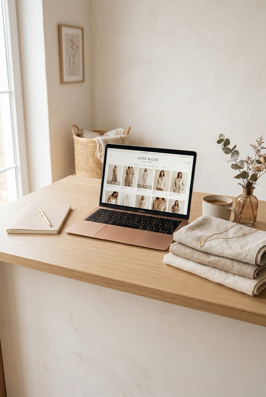
Of everything that shapes how an online store feels, imagery has the biggest impact. It’s more than your colour palette, logo, and fonts.
A visitor lands on your homepage and within seconds she’s formed an impression. And the first thing she sees will be the area at the very top of your store – the hero section.
Think of it like a shop window. A great window display doesn’t just show you the clothes — it tells you who the shop is for, what it feels like inside, whether you belong there. Your hero section does the same job. It’s the first thing she sees, and she’s already decided how she feels about your store before she’s read a single word.
So the most important branding decision you’ll make is this:
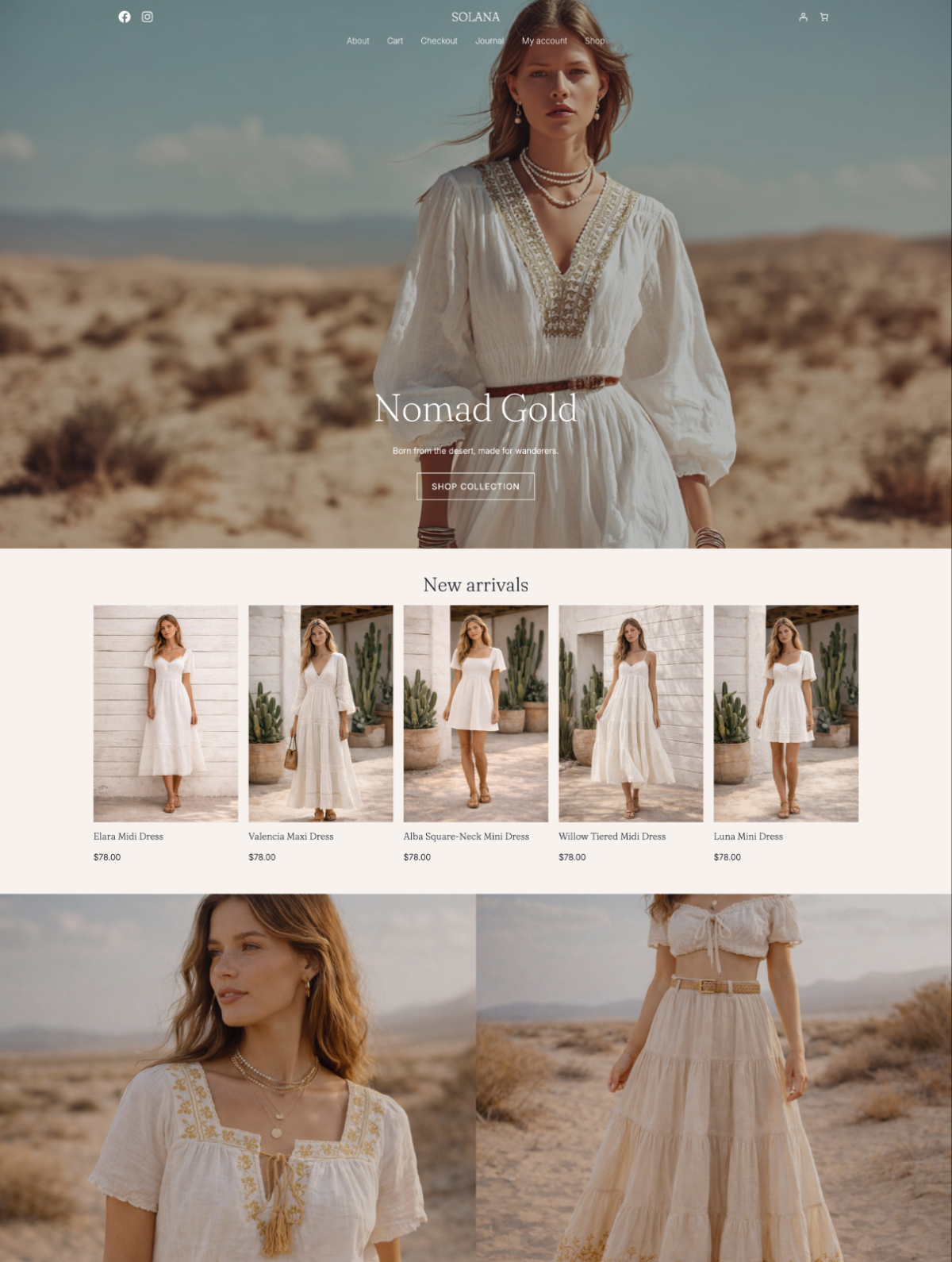
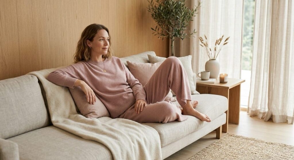
Find one image that captures your brand feeling completely.
It could be a photo you’ve taken, something from a photographer whose work fits your aesthetic, or a styled image you’ve commissioned. It should feel like the world your clothes belong in — the light, the mood, the setting, all of it. This image becomes your anchor. Your colour palette flows from it. Your homepage is built around it. Every other image in your store should feel like it belongs in the same world.
Don’t have your hero image yet?
Build a Pinterest board — clothing with a similar feeling to yours, interiors, photography, places, light. Not to copy, but to figure out the visual world you’re building. Thirty images is usually enough to start seeing a clear pattern. As you pin, think about:
- Light. Bright and airy, or moody and considered?
- Setting. Clean studio background, or a real environment that tells a story?
- The person in the clothes. How she carries herself, how she’s styled, her expression — all of it communicates your brand’s world.
Once you have your hero image, every other decision gets easier.
Step 3: Pull your colour palette from the image
This is where most branding guides send you to a colour wheel (never to be heard from again). Spoiler alert – you don’t need one.
Drop your hero image into Coolors.co palette generator. It pulls the dominant colours straight from the photo. Because the image already feels like your brand, the colours that come out of it will too. (It’s a bit of a magic trick, honestly.)
You need four colours:
- A primary colour. The one that leads everything — your logo, headings, key design elements.
- An accent colour. For buttons and links. Should complement your primary without competing with it.
- A background neutral. What your pages sit on. A warm off-white or soft cream will make your product photography look far more cohesive than stark white (unless stark and high contrast is what you’re going for).
- A text neutral. What your body copy is written in. Usually a dark charcoal rather than pure black — pure black on white is harsher than most boutiques want.
Write down the hex codes (the six-character codes starting with #) and save them somewhere you’ll actually find them. A simple notes document is fine. You’ll use these every time you create anything for your boutique — your website, your emails, your social graphics, your packaging.
One quick check before you commit: paste your text and background neutrals into WebAIM’s contrast checker. Low contrast makes a store look unpolished (not to mention hard to read).
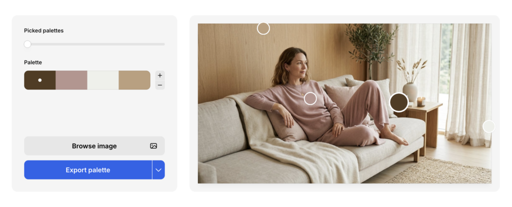
I love this tool, because it can generate multiple palettes from the image (that’s what the “Picked palettes” slider is for), it shows you exactly where on the image the color is pulled from, AND you can drag the circles around directly to fine-tune individual colors as needed.
Step 4: Choose two fonts
Yes, two fonts is all you need – one for headings, one for body text. That’s it.
The heading font sets the tone — the body font just needs to be easy to read.
Here are three pairings to get you started, each with a different feel (and all free on Google Fonts).
Elevated and elegant Instrument Serif + DM Sans — quiet confidence, editorial without being cold. Good for refined, considered brands with a strong visual identity.
Minimal and modern Inter + Inter — yes, the same font in different weights (crucial). Clean, stark, minimal, and completely pared back.
Warm and expressive Cormorant Garamond + Outfit (light) — romantic, a little vintage, full of personality. Good for boho, artisan, or independent labels with a strong aesthetic point of view.
Not sure which direction is yours? Search Pinterest for “font pairing” plus your aesthetic, for example: “font pairing minimal fashion”, “font pairing boho boutique”, “font pairing quiet luxury”. You’ll find curated combinations that already fit your world. Cross-check that the fonts are available on Google Fonts before you commit.
When you land on a pairing, write down the exact names and the weights you want (Regular, Medium, Bold).
To set them in WordPress: go to Appearance > Editor > Styles > Typography in your dashboard. Set your heading and body fonts there and they apply across your whole store immediately. For more detailed instructions, check out my post on how to add a custom font to WordPress.
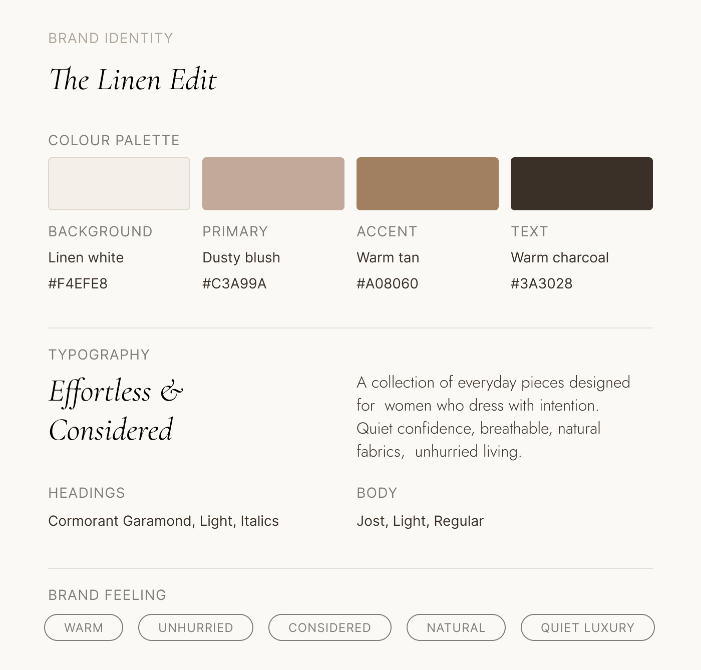
Putting it all together: example brand identity board
Remember that image I used to pull colors from? Here’s an example mood board that includes colors (straight from the image), font pairing that feels elegant and effortless, plus some keywords that guide the whole brand identity.
Step 5: Your logo
You probably already have one — even if it’s just your brand name in a font you chose when you set up your Etsy shop.
Before you do anything, check two things: do you have a version with a transparent background (PNG format), and does it still feel like your brand? If yes to both, upload it and move on.
If it feels off (wrong font, too casual, doesn’t match the store you’re building now), a clean reset is simpler than you might think. A wordmark in your heading font, made in Canva at 500 x 200px and exported as a transparent PNG, is often all you need. It’s not your forever logo — it’s a consistent, professional placeholder while you figure out the longer-term direction.
Step 6: Get it into your store
Start with your imagery (it does the most work)
Your hero image (from step 2) goes at the top of your homepage, it’s the first thing your customer sees and it sets the tone for everything below it. In your WordPress Site Editor, open your homepage template and find the hero section at the top. Most block themes have a Cover or Image block already in place — just replace the placeholder with your image.
Product photography is a bigger project, and if you’re just starting out you probably don’t have a full consistent set yet. That’s okay. Use your hero image as a brief for every other image in your store — same light quality, same mood, same setting where possible. Even phone photos can look consistent if the background and light source are the same every time. Same background, same light, same distance. That alone gets you most of the way there.
Consistent product photography is something you build towards. There’s a full post coming on exactly how to do it — for now, this is enough to get started.
Upload your logo
Go to Appearance > Editor > Header and upload your logo image (the PNG with transparent background). Check it on mobile too — if the size is off, adjust it in the Header settings.
Apply your colours
Block-based WordPress themes have multiple colour slots, and they’ll be labelled differently depending on which theme you’re using. Here’s how your four colours map to the most common ones:
- Background → background neutral
- Text → text neutral
- Headings → primary colour (or text neutral if you prefer a quieter look)
- Buttons → accent colour
- Links → accent colour
- Button text → whichever neutral contrasts well against your accent
Go to Appearance > Editor > Styles > Colours and work through each slot. If something looks off after — an unexpected background colour, a heading in the wrong shade — it’s almost always one slot assigned incorrectly. Go back through them one at a time and it’ll resolve.
Apply your fonts
Go to Appearance > Editor > Styles > Typography. Most themes have separate slots for headings, body text, and sometimes buttons or captions. Set your heading font for all heading levels and your body font for everything else.
For more detailed instructions, check out my post on how to add a custom font to WordPress.
Set your favicon
The small icon in the browser tab. Go to Appearance > Editor > Site Identity and upload a simplified version of your logo — or just the first letter of your brand name. Small size means simple works best.
Sort your WooCommerce emails
Go to WooCommerce > Settings > Emails, update the header colour to your primary, and add your logo. Your customer sees these after every order. They should look like your brand, not a default template.
Before you close your laptop: make a one-page brand guide
This takes five minutes and will save you hours (I promise).
Open a new document and write down:
- The feeling your brand is built around
- Paste in your hero image
- Your four hex codes, labelled: primary, accent, background neutral, text neutral
- Your two font names and weights
- Where your logo file is saved
That’s your super simple brand guide. Every time you create a social graphic, brief a photographer, or hand anything off to someone else — you open this. It’s what stops you slowly drifting off-brand over time.
FAQ
What does it mean to brand an online boutique?
Branding your online boutique means translating the creative vision in your clothes into every visual element of your store — your imagery, colour palette, fonts, logo, and the way you write. The goal is for your website to feel like a natural extension of your clothing, not a separate thing someone else built. When it works, customers feel the difference immediately, even if they can’t name it.
What has the biggest impact on how a boutique store looks and feels?
Imagery. More than your colour palette, more than your fonts — the photography sets the tone for your whole store. The light quality, the mood, the setting, the consistency across your product shots: these all form the first impression before a visitor has read a single word. Colours and fonts should complement and reinforce the imagery, not the other way around.
How do I choose brand colours for my boutique?
Start with your hero image — the one image that captures your brand feeling completely. Drop it into Canva’s colour palette generator and it pulls the dominant colours straight from the photo. From there, pick four: a primary, an accent, a background neutral, and a text neutral. Because the colours come from an image that already feels like your brand, they’ll naturally work together.
How many colours does a boutique brand need?
Four works well for most boutiques: a primary colour, an accent for buttons and links, a background neutral (a warm off-white or cream rather than stark white), and a text neutral (usually dark charcoal rather than pure black). Write down the hex codes and use them consistently everywhere — your website, emails, social graphics, packaging.
How do I apply my branding inside WooCommerce?
Start with your imagery — hero image on your homepage, consistent product photography throughout. Then in your WordPress theme, go to Appearance > Editor > Styles to set your colours and fonts. Different themes organise colour slots differently, so work through each one and assign your four colours accordingly. Upload your logo in the Header section, and update WooCommerce email colours in WooCommerce > Settings > Emails.
Do I need a new logo to rebrand my boutique?
Probably not. If your existing logo has a transparent background and still feels like your brand, use it. If it feels out of step with where you’re taking your store, a simple wordmark in your heading font is a clean reset — consistent and professional while you work on something more considered down the line.
What’s next
Once your store looks like you, the next job is making sure it converts. A well-branded store that’s structured poorly still won’t turn visitors into buyers — and that’s a different challenge entirely.
If you’re still choosing your theme, how to choose a WordPress theme for a fashion or boutique brand is worth a read before you commit to anything. And if you’re at the very start of building your store, the step-by-step guide to starting an online clothing boutique with WordPress has the full picture from scratch.
When you’re ready to look at themes built for fashion boutiques — with typography and colour systems designed to be replaced with yours — browse our WooCommerce themes →